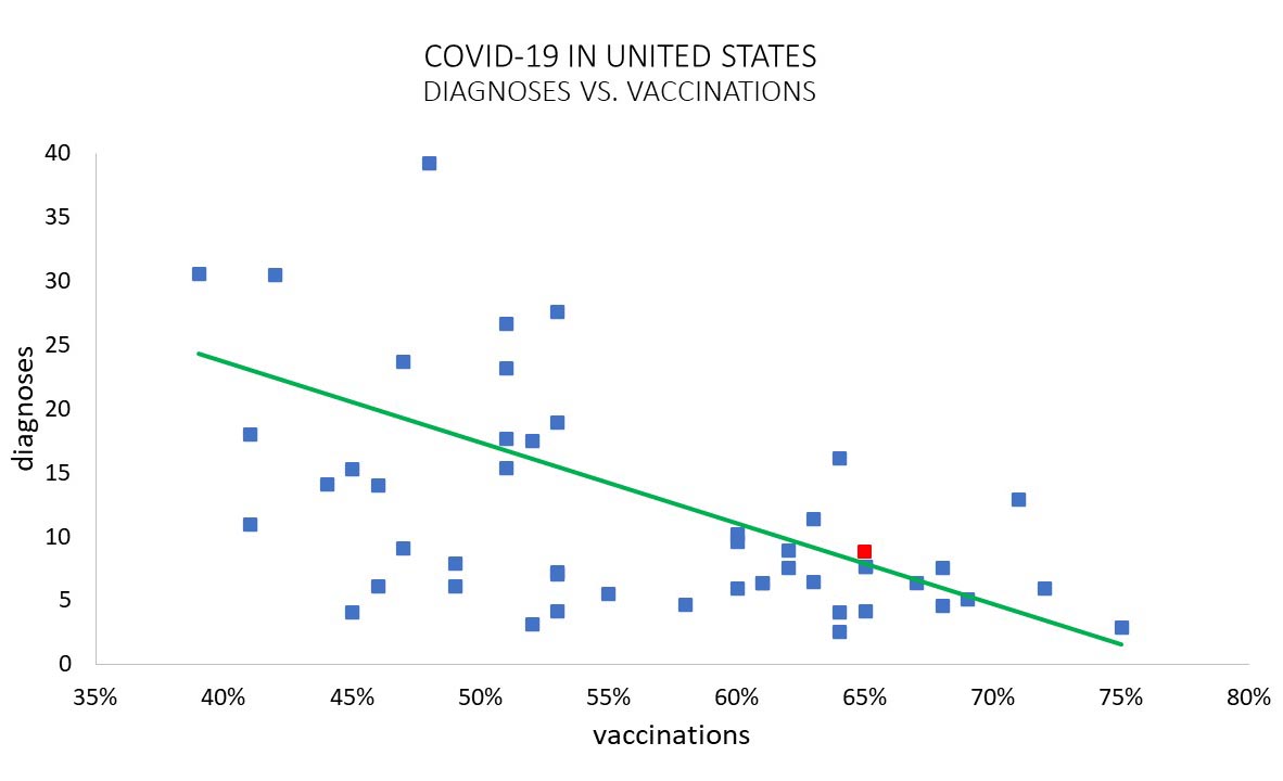
 This scatter plot shows the average number of daily diagnoses per 100,000 people versus percentage of the population receiving at least one vaccine dose. Shown are all 50 states, with New Mexico highlighted in red. The line represents a linear fit to the data. Source covidactnow.org. Created by Eli Ben-Naim

Menu
Chart 480 COVID-19 Update: New Mexico July 26

Copyright © 2012-2024 The Los Alamos Daily Post is the Official Newspaper of Record in Los Alamos County. This Site and all information contained here including, but not limited to news stories, photographs, videos, charts, graphs and graphics is the property of the Los Alamos Daily Post, unless otherwise noted. Permission to reprint in whole or in part is hereby granted, provided that the Los Alamos Daily Post and author/photographer are properly cited. Opinions expressed by readers, columnists and other contributors do not necessarily reflect the views of the Los Alamos Daily Post. The Los Alamos Daily Post newspaper was founded Feb. 7, 2012 by Owner/Publisher Carol A. Clark.